College students across the country should bow down to MillerCoors for the company's creation and launch of the Punch Top Can. The innovative Miller Lite cans, which provide a smoother pour than a standard can, were made available in national retailers last week. Have you ever heard of shotgunning? If not, please attend a college party or tailgate and get that out of your system. So much effort is put into finding a key, locating the air bubble, and creating the perfect hole. Now, shotgunners can simply punch the extra tab of their Miller Lite and chug accordingly. Apparently, you can use almost anything to punch the second tab: a house key, golf tee, or even a dollar bill. MillerCoors' Director of Innovation and Activation, Amy Breeze, revealed that consumers "prefer the Punch Top Can three-to-one over the standard beer can because it's more like drinking from a pilsner glass."
To accompany the Punch Top Can's launch, the brand is introducing a new advertising campaign. The new commercials will run through mid-August and highlight creative ways to punch the can and enjoy the flowing beer. The launch is also supported by print, radio, out-of-home and digital advertising, as well as point-of-sale and PR.
I, for one, am glad someone has come out with a better way to shotgun... especially before I graduate from college. It's about time! I just wish it was a different brand of beer-- I'm not particularly a fan of Miller Lite. On the other hand, the new Punch Top Can might be just the thing to switch me.
Marketers are finally figuring it out. Electronic dance music is here to stay and is a great way to entice teens and young adults (in this case, JUST young adults... 21+). The EDM industry provides a slew of up-and-coming, influential artists... AKA potential brand ambassadors and promotional partners. Absolut Vodka is ahead of the game and has roped in the famous Swedish House Mafia to create a collaborative multi-dimensional cocktail experience to promote the new Absolut Greyhound cocktail. The Swedish, grapefruit-spiked cocktail is Absolut's new signature drink, as well as the official drink of electronic dance music. The drink must be absolutely incredible, especially since it inspired Sebastian Ingrosso, Axwell, and Steve Angello's latest single... also called "Greyhound".
"Greyhound" is a bit more low-key than Swedish House Mafia's typical instrumentals... though it still builds up, breaks down... bass drop, etc. I'm sure that was a strategic decision when considering the commercial aspects of the partnership... not everyone can handle EDM. The track is pretty good, but the accompanying video really finalizes the partnership. It's a Sci-Fi-inspired, desert dog race. It's incredibly futuristic, quirky, and dramatic. The three SHM DJ's appear underground and are the controls behind the three robotic greyhounds. They are essentially disc jockeys--get it?! Check it out.
Swedish House Mafia is big in the EDM world--and I mean BIG. The Absolut partnership adds to the growing number of musical acts teaming up with beverage companies in order to push culturally relevant brands. This partnership is perfect. SHM will take Absolut far... or will it be the other way around? Either way, the iconic Swedish brands have collaborated to celebrate two incredibly important things in society: music and drinks. Cheers and rage on!
Don't worry, you're not going crazy. The title reads: Bacon and Eggs COCKTAIL. Restaurants have been playing off the gourmet comfort food for... well, forever. In the past years, however, I've come across a lot of savory cocktails on restaurant menus. There also seems to be some sort of obsession with bacon. I've come across various bacon-flavored products that range from gum, to chips, to toothpaste! Yes, your boyfriend, girlfriend, husband, wife, or roommate can wake up to your smokey bacon breath! Woohoo!
This specific Bacon and Eggs cocktail is offered at New York's Whiskey Blue. The cocktail, served "sunny side up" (get it?!), features whipped eggs mixed in with a shot of bourbon and smoked bacon. When I first read about this cocktail, I imagined that in the place of a celery stick or swizzle stick, there would be a crispy piece of bacon! Lo and behold, that's exactly what it has!
In addition to the Bacon and Eggs cocktail, they serve a Blueberry Scone cocktail, as well as a Waffle and Maple Syrup cocktail. As you might have assumed, the liquid comfort foods run for about the same price as the actual comfort foods -- $16.
So, instead of ordering a Bloody Mary or Mimosa at brunch, why not just go all out and get a Bacon and Egg cocktail to go with your... bacon and eggs?
On January 23rd, an environmental phenomenon occurred... the sun rose significantly earlier in central London than normal. Well, not really. It was a man-made sun, but it helped the real sun brighten Trafalgar Square. Not only did this "sun" rise an hour early, but it also gave Londoners three extra hours of "daylight"!
The "sun" was around 30,000 times bigger than a football and had the power of 60,000 light bulbs, which apparently means it could have been seen from space. Greyworld, a UK art collective, was commissioned by Tropicana to design and build the sun in order to launch the company's "Brighter Mornings" campaign. It was the perfect (and gorgeous) way to brighten up the dark, mid-winter day.
Photo Courtesy of Greyworld
Tropicana's "Brighter Mornings" campaign is a large-scale, integrated marketing campaign, which also includes a new Tropicana commercial. The key goal of the campaign is to increase sales and specifically link Tropicana with the ultimate way to start the day--yes, that rhymes. It also aims to strategically motivate retailers to back the campaign by selling single-serving Tropicana juices to boost on-the-go breakfast sales.
Obviously, an instillation like this is meant to generate a lot of online and traditional buzz... and Tropicana succeeded. There were TONS of tweets from consumers, marketing professionals, and media personnel from all over the world. Clearly, if the company was measuring the effectiveness of the campaign solely on the amount of digital buzz, they would be proud. Tropicana still needs some time, however, to see if the campaign influences positive sales results.
I love sunrises (when I'm unlucky lucky enough to catch them), but the installation was short-lived and the bang--or lack there of--didn't seem worth the time or money. The idea was pretty good, but the execution was... meh. It would have been a lot more impactful and memorable if Tropicana had these "suns" installed in multiple locations... maybe in specific areas that don't receive sunlight naturally. Money, however, is always a factor, and I'm sure the sun in Trafalgar Square didn't come cheap. I guess the rest of us will have to settle with the natural rise and fall of the real sun... "oh woe is me us."
I'm not a big fan of cats either, so me and the cat-eating dog from the Super Bowl Doritos ad should team up. The Great Dane and his bribing strategy really made a splash in Sunday night's Super Bowl advertising competition. The spot ranked number one in USA Today's Annual Super Bowl Ad Meter... and was voted one of the most popular Super Bowl 2012 ads in various other ranking systems as well. The Doritos ad, "Man's Best Friend", was one of two awesome consumer-generated advertisements that aired during the game--the other one, "Sling Baby", was a Doritos ad as well, and ranked number four on the Ad Meter! Jonathan Friedman, the ad's creator, will receive $1 million from Doritos for his nationally recognized ad, which only cost him $20! Cheap and no celebs? Way to go Average Joe Jonathan!
USA Today's Ad Meter is regarded as the most influential Super Bowl ad rating system in the advertising industry. It tracks the second-by-second responses of a panel of viewers during the national broadcast and has them rank the ads from favorite to least favorite. USA Today also recently introduced a Facebook app, which allows consumers to rank and share their favorites as well.
For those of you who missed the commercial (or the entire Super Bowl), here it is:
This is the sixth year Doritos has put on the Crash the Super Bowl contest, which invites regular "Average Joe's and Jane's"--AKA consumers--to submit ads. This year the contest received more than 6,000 submissions. After the Doritos team whittled that massive number down to five, consumers' votes determined one winner, while Doritos picked its personal preference.
Doritos may have the number one and four spot on the Ad Meter, but my personal Super Bowl fave is still top five... M&M's spot, "Just My Shell". I previously posted about the intro of Ms. Brown... and man, did she introduce herself! I was right, she is sassy! Absolutely loved it! And Red has never been so funny.
I don't think I'm alone in wondering why M&M's hasn't promoted their brown M&M. I get it, it's brown. It's not a lively or "pretty" color, but it's still one of the staple members of the M&M clan. Well, February 5th (AKA the SuperBowl) is when M&M's will finally introduce the apparently not so new brown character... and... IT'S A GIRL! Her name is Ms. Brown and she will walk and talk just like her fellow computer-animated buddies. I'm sure Ms. Green is thrilled to have a gal pal after all this time.
BBDO New York, M&M's preferred creative agency, has developed a few teaser advertisements to spark excitement and buzz among consumers and the media about Ms. Brown's debut.
Until the first quarter of the Super Bowl on NBC, we're left with her simple photograph... and 20 foot statue that was unveiled in LA on Monday... so much for the big bang of keeping her identity a surprise.
Her pose, raised eye brow, and unamused facial expression doesn't even leave her personality a mystery... she looks a little bossy sassy to me. I like it. She must be a pretty demanding M&M considering the amount of money the company is paying to formally introduce her during the Super Bowl. A 30-second spot on NBC during this extremely competitive air time costs around $3.5 million. OUCH! She deserves it though. She's been locked in the office and hidden from the public. She's worked hard as the CCO. Now, it's finally her time to shine and join her sweet M&M buddies in their efforts to promote M&M's of all colors, personalities, and fillings.
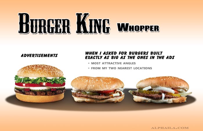
False advertising is rampant in the fast food industry. Have you ever seen your Burger King Whopper look exactly like it does in the commercials or print ads? NO! Have you ever seen your Taco Bell Crunchy Taco even remotely resemble its advertisements? NO! Though this reality hasn't stopped anyone (as far as I know) from repeat orders, we'll always be a little disappointed each time we unwrap our chicken sandwiches or cheeseburgers.
A photographer-gone-blogger provides an extremely in depth comparison of what we are "promised" by fast food advertisements and what we actually receive. This type of blog post has been done before, but this particular post puts a professional spin on the Average Joe posts of the past. And still... the findings are gross...and small...and squished. Poor us.
Note: "Most Attractive Angle" Also, I need to say it... where's the beef?!* *Wrong fast food restaurant, same idea
Note: "Slightly Fluffed Up" So sad.... but SUCH a reality.
Note: he asked for the Whopper to be built to mimic the ads... makes you wonder: Do they even have those ingredients?
And the winner is... McDonald's Big N' Tasty! I was a bit curious if these restaurants owned anything other than "shredded lettuce"...
How can you advertise something in "actual size" if it legitimately cannot fit in it's allocated box? Maybe that's why they always looked so squished? Nah, probably not.
I'm going on a very long road trip to Canada this weekend, and I'll still order something from McDonald's. It might not look (at all) like the advertisement BUT at least it tastes like it's advertised. I know... that's subjective.
Twitter and Facebook both create a ton of opportunities for companies to interact with consumers, but it is no secret that these social media sites pose massive threats as well. We are well aware that on our personal pages there are certain things we should never do or post. The same goes for companies... times 10. One of the most frowned upon social media practices is deleting unfavorable comments in hopes to maintain a positive brand image. When companies delete these comments or loosely/unprofessionally reply, their transparency and reputation plummet.
A well-known example of this type of social media disaster was Nestlé's response to Greenpeace's accusations in 2010. I learned about this crisis in my Global Marketing class, and it always comes to mind when other companies make similar silly (and damaging) mistakes. If you're not familiar with the story, let me fill you in...
Cue Greenpeace's (extremely graphic) video:
DO NOT WATCH IF YOU HAVE ISSUES WITH BLOOD... or monkey fingers)
Basically, Greenpeace (a non-governmental environmental organization) was raising awareness of Nestlé's use of palm oil in products, like Kit Kat. It's said that the palm oil companies they used cause extreme deforestation in Indonesian rainforests... and are responsible for the deaths of many native orangutans. Nestlé obviously tried to get the video removed from YouTube... sparking a social media war. Greenpeace started posting on Nestlé's Facebook page... Nestlé THEN made a detrimental mistake: they deleted the critical comments from Greenpeace and other users (especially those with the altered Kit Kat logo as their pictures).
Nestlé was not the first company to make the immature and inexcusable deleting mistake... and were not the last.
Recently, another company (or restaurant, in this case) got a slap on the wrist for their social media practices. Boners, an Atlanta BBQ joint, posted an extremely inappropriate blurb about a customer who "apparently" didn't tip. A rude customer and a bad Yelp review does not give restaurants (or any company) creative freedom to post anything like this... talk about a temper! After checking out their website... I'm not surprised. It doesn't seem like the classiest of establishments, but you can't judge a restaurant by its website (FALSE) who knows...
Boners has deleted the ridiculous post and the establishment's owner replaced it with a personal apology to Stephanie. His "sincere" post, however, has not quelled the equally inappropriate attacks against Stephanie from fellow Facebook users. Whoever is continuing to insult this woman via Boners' page needs to find a new hobby... I think she suffered enough from the restaurant's original post--don't you?
Scene: It's 9:30 AM and you have only been on the beach for 30 minutes, but the warm Caribbean sun is already hot enough to fry an egg. All you want is a Pina Colada or a Strawberry Daiquiri to quench your thirst... but it's not even 10 o'clock yet--let alone noon! To make matters worse, you see one of the resort's wait staff carrying a tray of frozen cocktails down the beach. You think to yourself: Already? The other guests must be animals--drinking at 9:30 AM? Hmm... those do look delicious... maybe a virgin Pina Colada? That would be acceptable, right?
Were these tropical frozen cocktails actually ordered by resort guests at 9:30 AM? Or is this merely a trick to motivate guests to start ordering daiquiri after daiquiri early in the day? These drinks cast some sort of spell over hotel patrons. Once you see a frozen cocktail you are left yearning for one until FINALLY you gather the courage to order a Miami Vice (half Pina Colada, half Strawberry Daiquiri... yum) for yourself. Maybe around 11 AM? It MUST be noon somewhere!
I don't believe tropical resorts attempt to deceive customers by carrying around Pina Coladas with no "owners" -- BUT if the morning is a little slow on drink orders, they really should consider sending servers out with trays of frozen deliciousness. It would be an effective marketing strategy and I think it would do the trick!
I haven't even shown you a picture and you're already aching for a Strawberry Daiquiri! Maybe Mango? Believe me, I feel your pain.
Skittles' "Touch The Rainbow" made-for-YouTube series is one of 2011's best ad campaigns. The seemingly 'interactive' campaign, created by BBDO Toronto, launched in March. The viewer's finger (usually pointer finger) stars as the leading character in each YouTube ad. The five videos are unique, quirky, and weird. After you watch one, you're bound to click the next to see what role your finger plays.
My favorite (you'll see why) is the video featuring the cat. This video prompted the campaign to go viral. It has over five million views on YouTube. The hitchhiker is a close second--I love it!
So weird... but incredibly novel.
Skittles is my absolute favorite candy... but, oddly enough, I have never visited the Skittleswebsite (until today). WELL... now I'll be on this never ending website forever. No, really... it actually never ends!
Get your creative juices flowing because now is the time to finally become an established designer... forHeineken! To celebrate the company's 140th anniversary, Heineken in the Netherlands developed the ultimate design challenge. Consumers can submit their own creative designs for a limited edition bottle (via Heineken's Facebook page). The page allows visitors to download the bottle template and create an original design.
The aim of the challenge is to connect people, and (of course) there's a catch! Your design is only half of the bottle! So, what happens to the other half? WELL, challengers must connect with other designers to create a complete bottle design. After all submissions have been evaluated, the winning combo team's design for Heineken's limited edition bottle will be sold globally in December 2012! How awesome would it be to see YOUR design on half of a Heineken bottle in stores?! You would have bragging rights... forever.
Interested? Check out this video, which explains the competition in a visual way. Fitting--it's a visual competition! HURRY UP because entries close on January 31st!
Side note: Heineken is really great at developing innovative limited edition bottles. In 2010, the company introduced the limited edition Heineken STR bottles. They could definitely be the coolest beer bottles EVER. Stylish in a normal setting, the beer became a fitting beverage for a rave when you shut off the regular lights and turned on the black lights. I'm bummed I never got to see them in person, but maybe with some begging and pleading Heineken will bring them back? Who knows...
Everyone LOVES when the holiday season rolls around and Starbucks finally ditches their regular coffee cups. Whether customers flock to the coffee shop for the holiday inspired lattes or for the cheerful red cups is up for debate. It seems to me that coffee just tastes better when it comes in a red cup with pictures of snowflakes or christmas trees.... but that's just me. My Starbucks holiday drink of choice is the Peppermint Mocha... I look forward to it every year! I also end up getting Starbucks 10 times more often... TEEHEE!
This year, however, Starbucks holiday cups are even MORE awesome.
They're interactive!
Everyone has an iPhone or Droid (poor Blackberry), and Starbucks is using this technology trend to its advantage. In November, Starbucks launched an innovative augmented reality app, called Cup Magic, which lets customers animate their coffee cups with their smartphones! By pointing the phone's camera at the holiday cups (and other select Starbucks products) the app brings the characters to life! The engaging app highlights 5 holiday characters: an ice skater, a squirrel (Don't they hibernate during the holiday season?), a boy, a sledding dog, and a fox.
The following video explains it all. Check it out.
The app also includes traditional and social sharing tools -- Duh. They'd be silly to forget social media! That's not all -- apparently there is also a prize at stake... incentivizing consumers to try to animate all 5 characters -- and buy more coffee!
There's still time to download the app and get your hands on those red cups! Now... if only I could get my hands on an iPhone...
Lynchburg, Tennessee. This post could end right here... BUT due to a recent holiday and whiskey-fueled event, I will continue! Jack Daniel's has taken its holiday celebrations to a new level in building the Jack Daniel's Holiday Barrel Tree! The tree, made almost entirely out of 187 hand-selected whiskey barrels, stands 26 feet tall in the center of Lynchburg (the whiskey purveyor's hometown).
Now, I know what you're thinking: free whiskey for Lynchburg, TN! No, no. Though the barrel tree was definitely a gift to the town, the whiskey was not included. The barrels were emptied before they were transformed into a sparkling symbol of Jack Daniel's holiday spirit. The whiskey from these barrels was used for the company's specific holiday line called Jack Daniel's Holiday Select, and is said to have the perfect balance of oak and vanilla character. Sounds like the perfect Christmas holiday blend to me!
The Holiday Barrel Tree is part Jack Daniel's larger holiday campaign (created by the ad agency Arnold Worldwide). The campaign includes a TV commercial, an interactive website, and a Facebook game.
The commercial promotes the whiskey and the barrel tree, and exudes the holiday spirit of gathering together as friends and family.
The Facebook game, Jack Daniel's Barrel Bandits, can be accessed only if you "like" the Jack Daniel's brand page (of course). The premise of the game is to protect the barrel tree by chucking snowballs at bandits (labeled as close friends of yours -- they pull the information from your profile). I'm usually pretty good at computer games (nerdy, I know), but I had some difficulty smashing the bandits with my snowballs. The angels, on the other hand, were snowball magnets. Oops! Needless to say, the barrel tree festivities were spoiled by my criminal friends.
Very modern and beautiful campaign! Jack Daniel's used online marketing perfectly and repurposed content from the actual Holiday Barrel Tree magically. I'm sure they made their hometown proud! Wooden barrels, decked with garland and lights, and topped with a star -- never would have believed something so simple could be so gorgeous!
It all started with Coca-Cola's great idea: This holiday season we should make the cans WHITE to represent our beloved polar bears, which have been the staple of our holiday advertising campaigns for so many years. Unfortunately, Coca-Cola discovered their "great idea" wasn't so fabulous after all... and we all know this was not the company's first experience with failed product (or packaging) launches.
For the first time in 125 years, the company ditched its classic red can used to signify "Original Coke". The campaign, which launched in October and was supposed to run through March, pledged to raise up to $3 million for the World Wildlife Fund. Clearly, Coca-Cola's "great idea" had deeper significance with meaningful aspirations. The campaign's philanthropic goal to protect endangered polar bears is extremely admirable, but the "disruptive campaign" aimed to grab consumers' attention actually ended up attracting a different sort of recognition.
According to ABC News, consumers complained that Coke's white can was easily confused with the Diet Coke's silver can. Understandable! An honest mistake! Usually the bright red can of Coke is easily distinguished from its low-calorie counterpart. Who cares about a few extra seconds taken to read the label? Consumers! While an accidental purchase of Coke instead of Diet Coke (or vice versa) may be an issue of preference for some, it can be a health risk for others (ex. diabetics) due to the difference in sugar content.
Photo from The Coca-Cola Company
Additionally, some consumers expressed their discontent on websites like Twitter and YouTube. Various unsatisfied customers claimed the actual soda had a different taste in the white can. DUBIOUS. Either way, no matter the color preference, confusion, or taste issues, Coca-Cola finally realized they made another mistake and had underestimated the importance consumers place on a classic (red) can of Coca-Cola.
As I mentioned before, this is not a new lesson for Coca-Cola. In 1985, the company swapped its classic Coke formula for what they believed would be a more popular, and sweeter, "New Coke". Their faulty market research resulted in a crisis, filled with boycotts, complaints, and violence (well... not violence, but you get the gist). Coca-Cola's original recipe and its classic red branding create an American symbol that consumers identify with. The same thing goes for Coke's red can! It's evident that consumers are comfortable with what they know (Remember Gap's new logo? It's OK if you don't, it didn't last long).
A company that relies on brand loyalty should gauge the potential negative effects of making changes (even if it's just the packaging). Its image (physical and perceived) is extremely important to the success of the company, its shareholders, and the overall happiness of its consumers. ABC News makes a good point: "Would the Golden Arches sell as many burgers if they were blue?"
I personally don't drink regular coke (Diet Coke fanatic!), so maybe I don't fully understand, but I thought the white cans were pretty creative (and awesome). They definitely caught my eye. So, Coca-Cola, your marketing tactics were successful for some consumers... just not the ones that would have made your campaign successful.
We rarely hear about the groups responsible for the restaurants we love and frequent. Over Thanksgiving break I went to dinner with a few friends to Lolita Cocina & Tequila Barin Greenwich, CT. I've been to some amazing restaurants, but I find Lolita to be extremely impressive. I should say that I rate restaurants almost entirely on their atmosphere, vibe, and website. I also love menus... so even if the food itself isn't superb (Lolita's food is incredible) I still can be impressed with the way they describe their actual menu items. cb5 Restaurant Group is responsible for this restaurant gem and has brought it to Boston as well.
The group has created the ultimate branded restaurant, and has woven that identity through every detail and space. Lolita's brand identity compliments its upscale mexican cuisine. Both restaurants feature lavash red and black decor, sexy music, and extremely dim lighting.
A "Lolita" is a spanish word referring to a young promiscuous woman. The restaurant definitely incorporates this reference into the overall vibe the diners experience. It is an elegant version of a Mexican speakeasy... sortof. You almost feel like a rebel being there, almost like you don't belong, but at the same time it lures you in. The restaurant somehow bonds with you with its intimate style.
Lolita gradually transforms into a chic night club scene with a DJ and dancing as the night progresses. It becomes quite the scene after 10pm. Visitors can choose from over 150 different brands of tequila and various signature margaritas, sangrias, and other cocktails. There is something for everyone... including non-alcoholic tropical house juices -- The Lime Coco sounds incredible and is made from fresh lime, coconut, citrus fruits, and garnished with mint and a blackberry... YUM.
When you sit at the table your seductive server brings a "palate cleanser". It's a fresh grapefruit granita splashed with an optional shot of tequila. The presentation is the most exciting part, as it is delivered to the table with dry ice smoke brimming over the silver bowl. With various delicious menu options, including guacamole with crap and lobster, bbq spare ribs, various tacos, quesadillas, and creative entrees, a second or third visit is absolutely necessary. As you receive your check you also get a sweet surprise! No, the bill will still be pretty steep BUT you get a complementary cotton candy for the table! So, even if you don't have room for a full desert, you get the sugary finale anyway.
And to top it off, you and your fellow diners are also given temporary Lolita tattoos and a damp towel for application. Unique and extremely fitting with the restaurant's theme. I love it!
The websites are branded the exact same way and are super fun and interactive with music and great page transitions. See for yourself! Greenwich Website & Boston Website.
If you get a chance to visit the Greenwich location of the elegant and seductive restaurant, don't forget to take a look at the bathroom... it is completely covered with blackboard wallpaper and chalk. Leave your mark on Lolita, because it will definitely leave one on you.
We all know Ronald McDonald... some may know him too well. He's been around for nearly 50 years, so I'd be worried for McDonald's if the clown (in a literal sense) didn't have such a strong global presence. He's so important to our culture (and children) that he has his own website! There are some people, however, that aren't thrilled with Ronald, and have been urging the fast food chain to retire their long-time mascot. Personally, I'm not a huge fan of clowns and I do think Ronald McDonald is a little creepy -- not nearly as creepy as Burger King's King -- but I don't think McDonald's is ready to let go of him.
He's a face for the brand. He humanizes the global chain. Yes, McDonald's has the "golden arches" but those arches can't engage customers. They can't shake someone's hand or pose for pictures. They won't be directly responsible for putting a smile on a child's face. Ronald McDonald is a friend, and while he hasn't been as visible in McDonald's ad campaigns as he has in the past, he still has a strong presence and connection to the brand.
The advocacy group, Corporate Accountability International, wants Ronald McDonald to step aside. They've created a website solely for this cause, Retire Ronald, blaming Ronald McDonald for prompting children to visit McDonald's and ultimately become obese (hmm...). I understand the advocacy group's reasoning, but their proposed solutions to the general problem are a bit ridiculous. Retiring Ronald McDonald will not remove a child's desire to visit the fast food chain. Getting rid of the toys in Happy Meals? That's another story. It's possible that future laws will prevent marketing fast food to children due to recent widespread childhood obesity... but for now, McDonald's is safe.
McDonald's says the clown is "an ambassador for good". He has "the smile known around the world," says Willard Scott, the creator of the mascot. Ronald McDonald is not only the face to the brand, or a character in commercials, but also the leader in McDonald's philanthropic efforts -- Ronald McDonald House Charities.
For now, our old friend, Ronald, is sticking around. Hopefully he'll be greeting McDonald's patrons, old and young, for years to come. Luckily, Burger King "dethroned" their creepy mascot in August... and replaced him with... a mom? Read morehere. I totally support that retirement. He's scary.
I was a Brownie myself as a kid, but appreciateGirl Scouts as well. I am not sure what distinguishes a Brownie from a Girl Scout -- I think that Girl Scouts are the "big kids" while Brownies are around 5-7 years old. From what I remember, the same rules and activities apply.
Everyone loves Girl Scouts. Everyone loves the cookies that Girl Scouts sell. Samoas are my favorite BY FAR. It's actually quite fitting that they come in a purple box... my favorite color. "According to the Girl Scouts of the USA, Thin Mint is the favorite," at least in terms of sales.
Girl Scout cookies are SO popular that the Ice Cream manufacturer Dreyer's/Edy's (depending on what area of the country you live) teamed up with the Girl Scouts to produce limited-edition Girl Scout Cookie-flavored ice cream. I am not a huge fan of ice cream, but when it comes to Samoa-flavored Edy's, you can throw me into the pot of ice cream-obsessed fools.
I don't mean to jump the gun. I know it's not cookie-selling season yet and I apologize for making you crave something you can't have yet... so why am I writing about Girl Scout cookies? That can easily be explained by my "sign off" phrase... POGS! If you were able to decipher this acronym on your own, you should go treat yourself to about 5 boxes of Samoas (in a few months). If not, I'll spell it out for you:
Peace Out Girl Scout
I have absolutely no idea where my Dad came up with this phrase, but he has been signing his e-mails (to my sister and me) with it for a while now. He's pretty clever and it makes me laugh every time.
Copying is the finest form of flattery -- at least in this sense.
What does a big, juicy, multi-patty cheese burger have to do with Nick Lachey? Everything, according toEagle's Deli.
The famous Eagle's Deli of Cleveland Circle, is a favorite to locals and Boston College students. If you have never heard of Eagle's Deli, it is a standard burger joint featuring an array of burgers and menu options. It is absolutely delicious -- especially The Zoo (yum)! It is also known for its Challenge Burgers, which range in size from 1 1/2 pounds of meat to the notorious Eagle's Challenge burger with 5 pounds of meat, 20 pieces of bacon, 20 pieces of american cheese, 5 pounds of fries, 1 deli pickle, and 1 fountain soda... all for around $60. Many, and I mean many, brave (and hungry) people have attempted to tackle the Eagle's Challenge burger within the allotted 1 hour, in hopes to get a $60 refund, $100 gift certificate and to have the burger named after them. Apparently only one guy has succeeded (I'm still skeptical)... but the courage (or embarrassment) of the rest of the other challengers' failed attempts are always flaunted on the Wall of Shame in the restaurant.
Eagle's Challenge Burger
Nick Lachey visited Eagle's Deli in 2010 and supposedly took a crack at the Eagle's Challenge burger. Nick Lachey is not just an ordinary customer for Eagle's Deli, he's famous... or was famous. I guess that because Nick Lachey was once a "big-time celeb", the owners of Eagle's Deli believe he still deserves to have a burger named after him (even if he didn't come close to conquering the real challenge.) The Nick Lachey Burger has 1 1/2 pounds of beef, 6 pieces of swiss cheese, 6 pieces of bacon, 1/2 a pound of fries, and a fountain soda.
I laughed when I saw the Nick Lachey Burger on the menu. I though to myself, what guy would ever have the courage or self-esteem to mumble out 'I'll have the Nick Lachey Burger, please.' If I ordered it, I don't think I could manage to get the full order out before giggles took over. It is also a burger that deserves to be at the end of every joke because it is not even close to matching up to any of the real Challenge Burgers. I am sure it was not the intention of Eagle's Deli, people are more scared of ordering the Nick Lachey burger than the much larger Paul Jones Burger!
On another note, where did Nick Lachey even come from? I do not intend this to be mean, but he completely fell off of the face of the Earth after he and Jessica Simpson broke up. Was this was a publicity ploy set up by Eagle's Deli or by Nick Lachey's agent? When patrons walk into Eagle's Deli, the first thing they see is a picture of Nick Lachey on the Wall of Shame.
My peers and I are the main target consumers of Eagle's Deli, and Nick Lachey is not an appropriate celebrity to promote Eagle's Deli burgers. Also, consider the fact that Eagle's Deli agreed to create a smaller burger to add to their impressive Challenge Burger menu... what does that say about Nick Lachey? This makes both parties seem pretty desperate... but as they say, "all publicity is good publicity?"
PS. Something that DOES make a TON of sense is Eagle's Deli and Man v. Food... Check it out.


